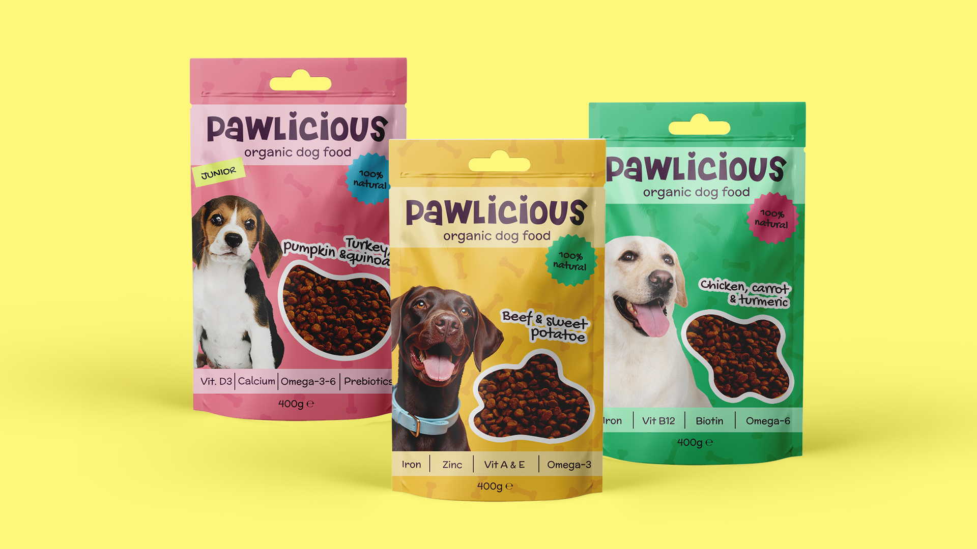
The project required the creation of a visual identity and packaging design for a handmade dog food brand based on natural, high-quality ingredients. The visual direction needed to communicate warmth, care, and authenticity, inspired by the idea of home-prepared food. The brand was expected to have a colorful yet controlled visual language — vibrant but not overly busy or chaotic — with a handcrafted feel. Packaging had to be clear and well-structured, ensuring easy navigation and product differentiation through carefully selected color accents while maintaining overall consistency. Typography, color palette, and graphic elements were required to support a friendly and trustworthy tone, reinforcing the brand’s artisanal values and avoiding an overly commercial or mass-market appearance.
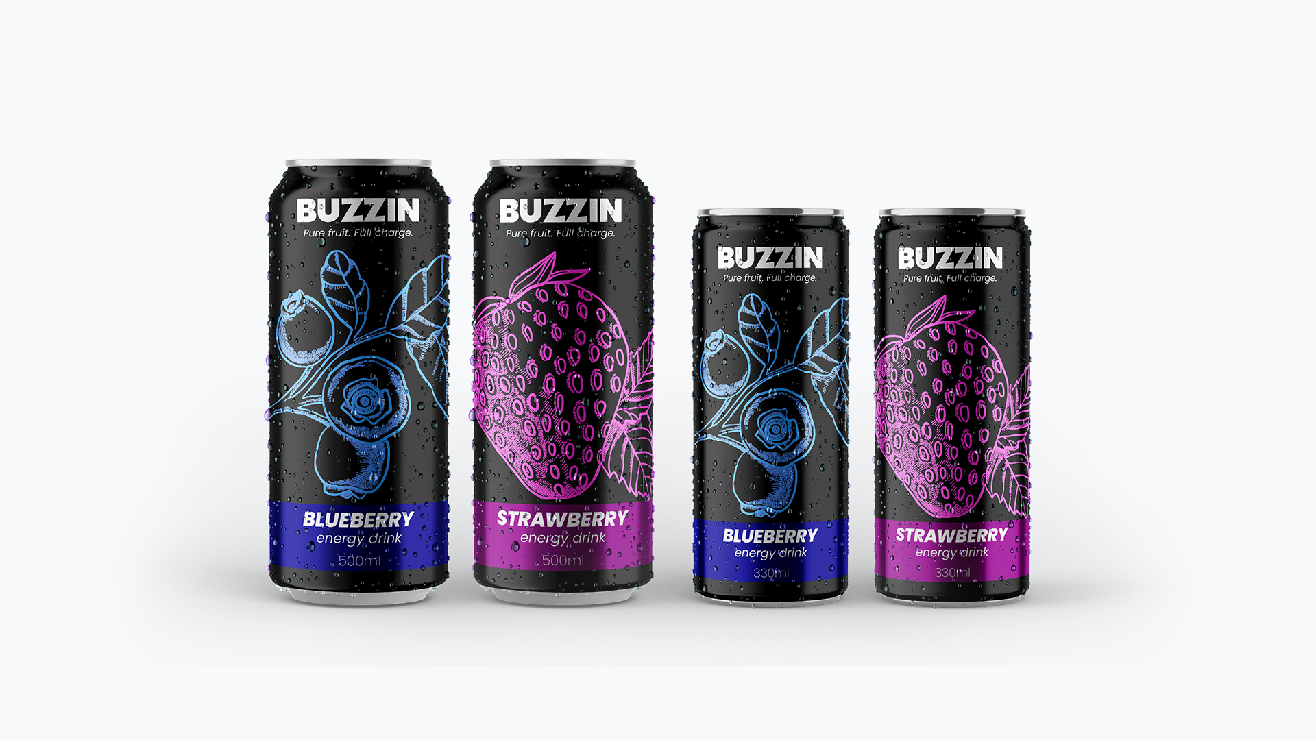
The brief required the creation of a visual identity and packaging design for a new energy drink line, BUZZIN. The goal was to build a bold and youthful brand with a strong character that stands out from major competitors through a fresh, urban attitude and an emphasis on real fruit flavors. The visual direction needed to be modern and energetic, inspired by street culture, with a primarily black-and-white color palette complemented by controlled color accents for flavor differentiation. The design was expected to be high-contrast, recognizable, and balanced, avoiding visual overload. Typography was required to be contemporary, highly legible, and primarily set in bold font weights, with clear hierarchy and confident presence. The overall visual style aimed to feel dynamic and distinctive, relying on strong design rather than excessive decoration.
Все още няма отзиви.
Сподели в:
Вграден бутон:
<a href="https://freelancebg.eu/freelancers/nevena-damyanova252" style="display:inline-block;background:#6366f1;color:white;padding:10px 20px;border-radius:8px;font-weight:700;text-decoration:none;">Наеми ме на FreelanceBG</a>
Сложи го в твоя сайт или блог